
Colouring digital collections: Challenges and opportunities for the use of colour metadata in cultural collections
Geoff Hinchcliffe, Australian National University, Australia, Mitchell Whitelaw, University of Canberra, Australia
Abstract
Discover the Queenslander is an online interface to a collection of around 1,000 digitised pages and covers from The Queenslander, a magazine supplement for the Brisbane Courier (1899-1939). Developed by the authors and commissioned by the State Library of Queensland, this interface features a range of rich approaches to representing, navigating, curating and sharing the collection. In particular the interface treats colour as a tool for exploration, revealing the distinctive colours of the collection as well as relationships between colour and time, creator, and other features. Colour is shown to be a compelling form of metadata that can be employed in unique representations of a collection and as an effective component of navigation and curation. Colour metadata is emerging as a feature of online digital collections, including the Cooper Hewitt Museum, Rijksmuseum, Dallas Museum of Art, and V&A, as well as image services such as Flickr and iStockPhoto. Through a comparative analysis of these approaches and our own work on Discover the Queenslander, we outline some of the challenges and opportunities for the use of colour metadata in digital collections. A key question is the role of colour in representing visual collections. In addition to documenting important practical and technical concerns, we reflect on critical issues that arise in working with digital cultural collections, such as the assumptions and biases built into algorithms, and the authorial agency that is exercised in aggregating and synthesising data of any kind. While these issues are not confined to working with colour metadata, colour provides an engaging way to make these concerns visible.Keywords: colour, metadata, visualisation, generous-interface, digital-collection
1. Introduction
Large-scale digitisation is bringing vast visual collections online, transforming access to art and visual culture in the process. Projects such as the Rijksmuseum’s celebrated relaunch demonstrate the value of online access to high-quality visual collections. To better expose these treasure troves, institutions are also developing more browsable and engaging interfaces, moving beyond the standard search-and-list. In recent years, colour has emerged as a feature in these interfaces. In the collections of the Rijksmuseum and the Cooper Hewitt, for example, colour becomes a navigable feature, a way to both celebrate and investigate the visual qualities of the collection.
This context informed our recent work on Discover the Queenslander, a collection of around 1,000 digitised pages and covers from The Queenslander, a magazine supplement for the Brisbane Courier (1899-1939) (http://www.slq.qld.gov.au/showcase/discover-the-queenslander). Developed by the authors and commissioned by the State Library of Queensland, this interface features a range of rich approaches to representing and navigating the collection. In particular, it treats colour as a tool for exploration, revealing the distinctive colours of the collection as well as relationships between colour and time, creator, and other features.
Through documentation of the Queenslander project and a comparative analysis of colour in other digital collections, this paper outlines some of the challenges and opportunities that colour presents. In tracing colour data through technical pipelines of extraction, aggregation, and interface, we show how it is generated, constrained, and transformed. As the Queenslander project shows, colour can be an evocative and revealing means of engaging with a collection. More broadly, it also demonstrates the critical roles that data and computation play in mediating digital cultural collections.
2. Pixels to palettes: Colour in digital collections
To date, much focus in digital cultural collections has been on providing well-structured metadata that describes collection items. While this textual data is well suited to conventional, search-focused collection interfaces, the digitisation of primary content also provides a wealth of new data, often digital images. In the simplest terms, digital images are grids of colour values (pixels). The growing use of colour as a feature in online collections seeks to exploit this image data, transforming colour into a feature that sits alongside traditional metadata.
Working with image data involves two related practical challenges: scale and granularity. Images typically contain millions of pixels, and each pixel may have one of 16.7 million unique values. For colour to be a usable feature of a digital collection, we need to compress this data drastically. Each image will likely contain many thousand unique pixel values, but a human observer will likely identify far fewer distinct colours. These distinctive colours—the image palette—are central to the work discussed here. “Palette extraction” or image quantization techniques provide a way to automatically generate image palettes from source image data. However, different algorithms give different results. Figure 1 compares the results of different palette extraction algorithms for the same images. Figure 1d shows Willem Bartel van der Kooi’s Piano Practice Interrupted from the Rijksmuseum collection, comparing the Rijksmuseum’s image palette with one generated using Colorific (Hotson & Yencken, 2012). Colorific is the basis of the RoyGBiv algorithm used by Cooper Hewitt (Parvaneh, 2012).
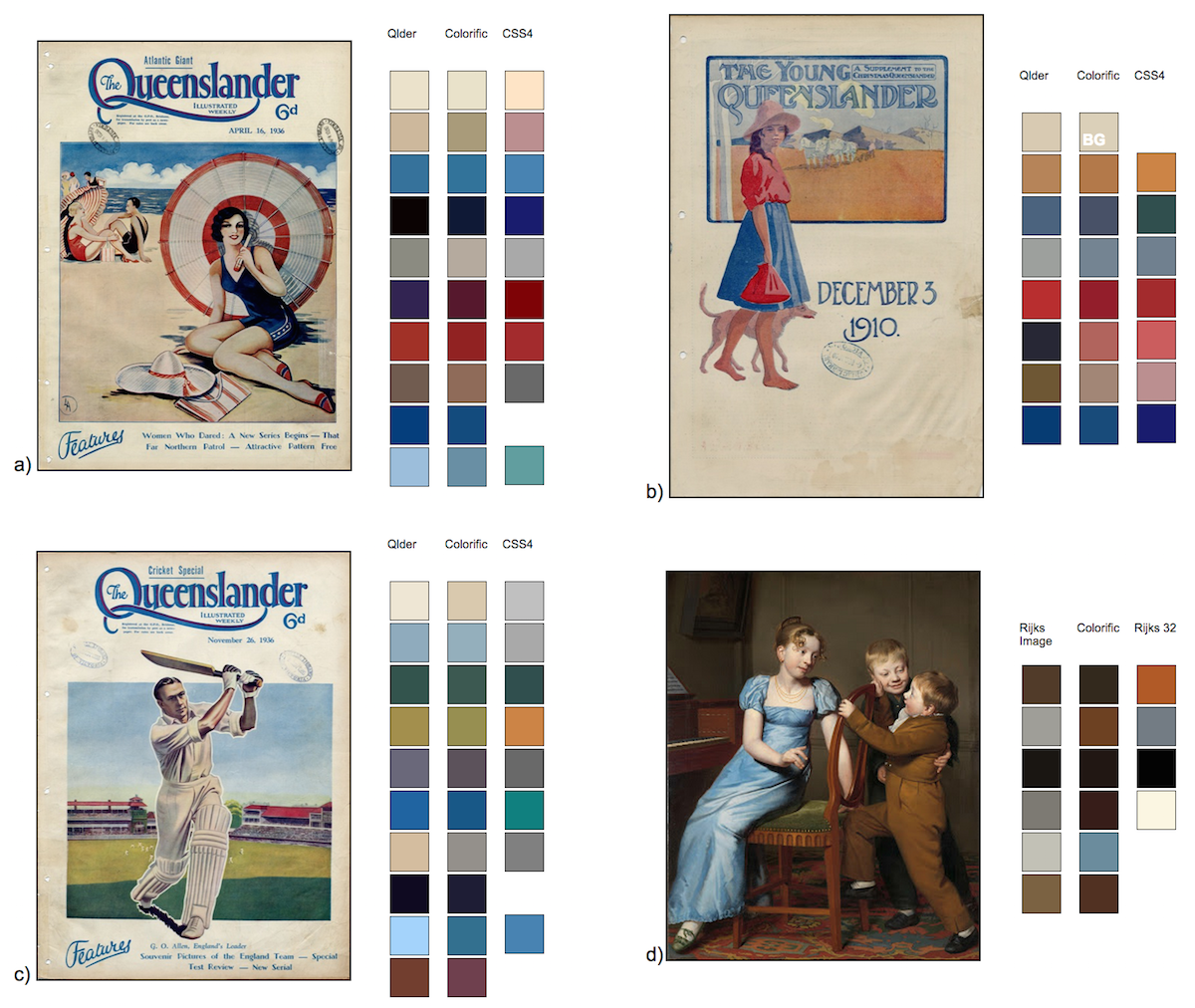
Figure 1: comparisons of Queenslander, Rijksmuseum, and Colorific image palettes, and CSS4 and Rijksmuseum global palettes
Like textual metadata, image palettes encode something distinctive about an item in a compact digital form; though unlike text, this data can strongly evoke its specifically visual character. When generated at collection scale, image palette data also presents new challenges. Like pixel data, image palettes are extremely fine-grained: the palette of a whole collection will contain millions of unique values, yet many of these will be indistinguishable to the human eye. The Dallas Museum of Art’s colour interface, which shows up to 100 colour values at a time, illustrates this (https://www.dma.org/collection/search).
To reduce the unwieldy scale of this colour data, many digital collections use what we term a global palette. This is a smaller, defined set of colours applied across the collection. Colours in the extracted image palettes can then be mapped or aggregated to similar colours in the global palette. The Cooper Hewitt colour interface uses a 139 colour palette based on the CSS4 Web standard (among other palettes) (https://collection.cooperhewitt.org/objects/colors). The Rijksmuseum interface uses a much smaller 32-colour global palette (https://www.rijksmuseum.nl/en/search?f=1&p=1&ps=12). A small global palette is easier to display; it also increases the connectivity of the colour palettes. In other words, a smaller palette makes it more likely that several items will share a given colour. In the Rijksmuseum, Cooper Hewitt, and DMA, colours act as search parameters or facets in a standard collection interface. Colour values (as hex strings) are much like any other tag: searching for “#6495ed” (cornflower blue) will simply return all items with matching values. Thus the connectivity of a global palette makes a collection more browsable, increasing the number of matches while reducing the number of possible colour values.
At the same time, the process of aggregating a global palette—reducing millions of colours to tens or hundreds—is a form of “lossy” compression. In reducing variety, this process weakens the relationship between the palette and the original image. Figure 1 (a-c) shows the results of mapping the Colorific image palette to the CSS4 global palette, for three images from the Queenslander collection. These palettes were generated using the Cooper Hewitt’s Swatchbook code (Cooper Hewitt, 2014). Figure 1d shows the Rijksmuseum’s own 32-colour global palette for the Van der Kooi painting, which bears little relation to the source image. The larger CSS4 global palette provides closer matches, but still introduces significant variation. Note how the pale blue in Figure 1a is mapped to the much greener CSS4 “cadetblue” (#5f9ea0) and how the yellow-green of the cricket pitch in 1c is mapped to the ochre-coloured CSS4 “peru” (#cd853f). The gaps in the CSS4 palettes show how the snapping process shrinks the palette, as different image palette colours are merged.

Figure 2: details of colour interface elements on the Rijksmuseum, Dallas Museum of Art, and Cooper Hewitt sites (clockwise from top left)
In these digital collections, colour is both a form of metadata and an interface. These examples take a range of approaches, illustrated in Figure 2. The Rijksmuseum includes colour as a facet in the main Search interface, with a compact grid of 32 global palette chips (though unlike other facets, there is no indication of the number of works linked to each colour). Image palette colours are featured in the Rijksmuseum’s detailed item view; however, each chip leads to a search query for the closest global palette colour. Thus there is an unannounced slip or gap between the interface (which closely reflects the image) and the search query.
Cooper Hewitt features colour in a dedicated “Explore” mode (Figure 2), which displays the global palette; each chip shows a count of linked items on mouseover. The Cooper Hewitt interface also shows item colours prominently alongside image thumbnails in search or browse results; each item-level chip leads to the colour explore interface. Once again, item colours use the image palette, and the colour browser uses a global palette. Here, however, the site clearly spells this difference out: “The closest color to #c6ba7a in the CSS4 color palette is darkkhaki which in robot-speak is #bdb76b” (https://collection.cooperhewitt.org/objects/colors/c6ba7a).
The Dallas Museum of Art offers a global browse-by-colour mode, as well as (uniquely) a picker-based interface that enables a query by any colour. DMA includes colour as a feature in the faceted search interface, showing a list of the top 100 image palette colours in the current set. The unwieldy scale of this list helps show the benefits of a compact global palette for navigation and exploration. Notably, the DMA site does not expose item-level palettes at all, though it does enable exploration of similar items by colour from the item detail page.
| Cooper Hewitt | Rijksmuseum | Dallas Museum of Art | Discover the Queenslander | |
| Global palette | Pre-existing CSS4/CSS3/Crayola | Static 32 colour | None | Dynamic, Adaptive |
| Global palette size | 120-144 | 32 | NA | Up to 64 |
| Item palette | Up to 5 chips.
Image palette Interactive |
Up to 6 chips.
Image palette Interactive |
Not visible | Up to 10 chips.
Image palette Interactive |
| Item palette weighting | N | N | N | Y |
| Colour overview | Palette | N | Y – top colours | Y |
| Colour query | Y – Global palete | Y – Global Palette | Y | Y – Image palette proximity |
| Colour facets | N | N | Y – unclear? | Y |
| Multi-colour query | N | Y | N | N |
| Colour query | Server-side | Server-side | Server-side | Client-side |
| Collection Size | > 65,000 | > 125,000 | > 17,000 | 989 |
Table 1: comparison of colour features across collection sites
These examples illustrate some fundamental shared concepts, such as image and global palettes, as well as the range of emerging approaches to colour in online cultural collections. In Table 1, we summarise and compare the features of these three examples as well as our own work, outlined below. Colour palettes can provide compact but evocative visual data, which can in turn support new modes of exploration. Much depends, however, on how that colour data is extracted, aggregated, and presented. In the next section, we present our own work with colour in the State Library of Queensland’s Discover the Queenslander. Through this project, we demonstrate some new approaches, emphasising colour as part of an exploration-focused “generous” interface.
3. Colour in Discover the Queenslander
Discover the Queenslander is an online interface to a collection of around 1,000 digitised pages and covers from The Queenslander, a magazine supplement for the Brisbane Courier (1899-1939). Developed by the authors and commissioned by the State Library of Queensland, this interface features a range of rich approaches to representing, navigating, curating, and sharing the collection. The site uses a client-side architecture: the browser loads metadata for the entire (small) collection and uses AngularJS to build a responsive HTML interface based on that data.
Our work with colour was motivated by several factors. The Cooper Hewitt’s open approach provided an exemplar and some technical tools, and we brought an intrinsic interest in colour as a form of digital material. Our collaborators at the State Library of Queensland sought an interface that emphasised visual exploration. Ultimately the collection itself was central: our aim was to use colour to reveal and celebrate the visual character of this material.
In generating image palettes, we experimented with existing algorithms including RoyGBiv (Parvaneh, 2012) and median cut (Mwcz, 2012), before finally developing a simple algorithm of our own. Like RoyGBiv, our approach ranks image pixel values according to frequency, then compares and merges them based on proximity. If a colour is within a certain “distance” of a more prominent colour, it is aggregated with that colour; if not, it forms a new palette swatch, up to a maximum of ten swatches. “Distance” here is simply the difference between the sum of the R, G, and B values. This measure is more basic than Delta E, a measure used in Colorific and RoyGBiv that approximates human perception of colour difference; yet in our testing with this collection, it gave more visually pleasing results. Our palette extraction algorithm was tuned through a process of subjective evaluation with this collection, as we sought palettes that most accurately represented the character of these images.
Our experiments also revealed specific features—and related assumptions—built in to Colorific and RoyGBiv. These algorithms try to identify a “background” colour and exclude it from the palette. Yet in this collection, we found the background tones and textures to be integral to the quality of the images; our simpler palette extraction process preserves them. Figure 1b compares our extracted palette with Colorific’s results for the same image, showing the identified “background” colour.
As well as colour values, our algorithm returns a frequency weighting for each palette colour: this is simply the proportion of image pixels aggregated into a given palette colour. For example, in an image of 76,000 pixels where 6,080 pixels are merged into one palette colour, that colour will have a weighting of 8 percent. These weightings can then be used in ranking the results returned when browsing by colour (Figure 3).
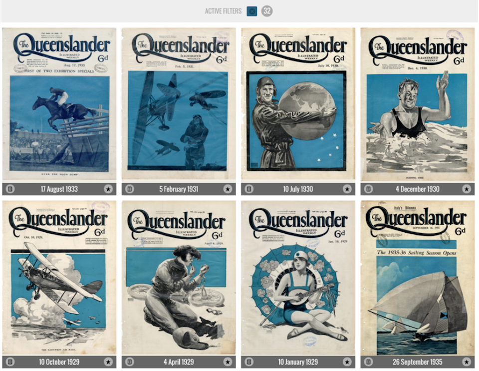
Figure 3: Queenslander collection items filtered by colour and ranked according to colour weighting
As well as showing item-specific image palettes, the Queenslander grid interface presents an aggregated global palette. Unlike the Cooper Hewitt and Rijksmuseum global palettes, which are static and predefined, this ribbon of up to 64 colours is generated dynamically from the palettes of items in the current selection. Here we use a Javascript implementation of the median cut algorithm (Mwcz, 2012) to rapidly analyse and aggregate the image palettes on the client side. Thus our global palette acts a form of data visualisation: at the top level it provides a colour overview of the entire collection, but in conjunction with the other facets it also reveals the distinctive colours of a particular time period, an individual artist, or subject term (Figure 4).

Figure 4: detail showing the aggregated palette for works by Esther Paterson
The global palette ribbon and image palettes are also interactive, with each colour chip acting as a way to filter the collection. Again, our client-side architecture enables us to take a more dynamic approach than Cooper Hewitt or the Rijksmuseum. Rather than making a database request for all items with a certain global palette value, we use the specific image (or ribbon) colour and return items with similar colours based on simple differences in hue, saturation, and brightness values. A client-side approach enables us to preserve the fine-grained differences intrinsic to the image palettes and use those colours as filters for the whole collection. Once again, this algorithm was tuned through trial and error and subjective judgement, seeking results that resonated with the filter colour while also returning a useful range of items. Just as the global ribbon reveals colour attributes of specific selections, the colour filter is linked to other facets; thus selecting a colour shows the dates, subjects, and creators of the related items.
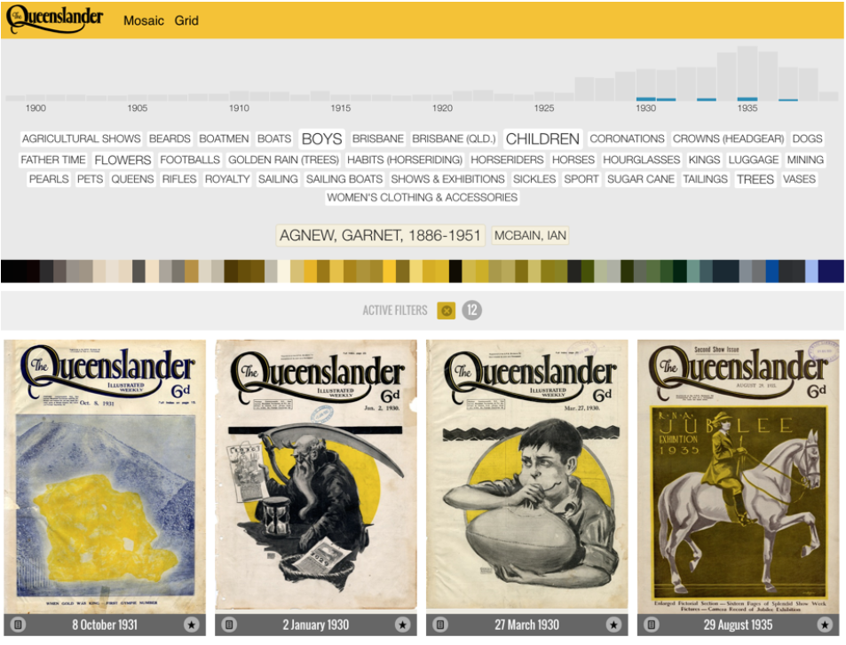
Figure 5: detail showing the Queenslander collection filtered by colour, including related dates, subject terms, and creators
4. Contingencies of Colour
Digitisation transforms our cultural heritage into data—a protean, abstract material that brings opportunities as well as challenges. The representation of digital cultural collections is one such opportunity and challenge. Exactly how these collections are represented shapes how they are manifest for us and how they are accessed, appreciated, and interpreted; and this representation is, as Whitelaw (2015a) has argued, always contingent. Colour provides a small but tangible case study that demonstrates this contingency. In the projects discussed here, image data moves through pipelines of extraction, processing, and aggregation, and the end results powerfully shape the way that colour operates in these collections. This pipeline is based on authorial decisions: there is no single “right” solution for extracting and representing the colour of digital collections.
Due to the sheer scale of these collections, authorship here necessarily involves combinations of human and algorithmic (but no less authored) agency. As our experiments with colour have shown, different algorithms give different results; they mediate the digital representation of collection items. Only by opening up the “black boxes” of these algorithms, or hand-crafting them anew, can we expose and grapple with the specific decisions and judgements that they encode, such as the automatic background detection built in to Colorific and RoyGBiv. Open source software is a significant asset here, as it enables those algorithms to be read; an open discussion (and sharing) of back-end algorithms implemented in museums is equally important.
Palette extraction and aggregation algorithms are formative, but these also link into a complex stack of technologies and interfaces that again mediate the collection. Aggregated colour metadata can integrate readily with a conventional, database-driven collections site. Like tags or any other string, colour palettes can be treated as another data field to be indexed and faceted. Yet even here the algorithmic mediation of data is prone to slips and glitches. While studying the Rijksmuseum’s 32-colour global palette, we observed some curious inconsistencies: the palette interface often shows duplicate colours, yet these give different results when filtering the collection. It seems that some colour values in the global palette have a leading space character encoded in: this generates a different query value, which in turn gives a different filter result. As well as revealing the fragility of (colour) metadata, this glitch shows how different levels of tolerance in technical systems can interact to conceal inconsistencies. The Web browser happily ignores the leading space to render a colour value; but the database back end, treating the colour value as a string, does not.

Figure 6: Rijksmuseum global palette interface showing two of the duplicate colours and differing result counts
The contingencies of working with collection data and its representation are not a problem to be overcome or concealed; they present both challenges and immense creative opportunities. The Cooper Hewitt project exposes some of these qualities by allowing its users to adopt and apply different colour palettes. This emphasises that there is no single correct solution. Similarly, the clear explanation of the “snapping” of image palette to global palette in the colour interface exposes that gap of data mediation and its algorithmic (“robot”) quality (Figure 7). By exposing this seamfulness, Cooper Hewitt provides its audience with a greater understanding of the system, including its limitations.
By contrast, the Rijksmuseum example provides little detail of its workings, which proves particularly problematic when the system fails as outlined above. The same issues that are framed as playful and characterful seams in the Cooper Hewitt context are inexplicable and frustrating system failures in the Rijksmuseum context. In Norman’s terms, Cooper Hewitt provides an expanded user model that exposes the seams that would typically be hidden from view (Norman, 1988). As Chalmers and Galani (2004) argue, “[W]e should not always rely on the traditional categorisation of error and uncertainty as features of the system to be hidden and reduced.” The operational benefit of this approach is that when confronted with seams, users are prepared, but it also has an ethical dimension: users are entrusted with this information and considered capable of navigating the seams.
Figure 7: Cooper Hewitt makes plain its process of mapping local colours back to the global CSS palette
Our practice-led research with the Queenslander collection has driven this analysis, but the project itself also offers specific innovations and novel approaches to digital collections. This small collection enables us to handle all metadata on the client side and thus use the browser to do complex calculations such as colour proximity that would otherwise be unfeasible. This in turn lets us do away with a fixed global palette and instead create a dynamic clustered palette, as well as using proximity (rather than a simple generalised colour string match) to query the collection by colour. Our query-by-colour process uses colour prominence to rank results, which is enabled in turn by a bespoke palette extraction algorithm. Using fine-grained image palette colours for filter queries results in both better specificity—more accurate matching of colour—and a much wider variety of unique filter results. In the Cooper Hewitt colour interface, all queries lead to one of 120 fixed, predefined item sets, returned in the same order. The Queenslander system provides thousands of unique colours, each generating its own filtered view of the collection.
Along with our previous “generous interfaces” (see Whitelaw, 2015b), this project shows some of the advantages of a client-side approach to digital collection interfaces. Browsing and filtering becomes practically instantaneous, and we can use the browser to dynamically generate new overviews—from tag clouds to histograms and colour ribbons—based on the collection data. Projects such as the New York Times’ Tamper and Pourover libraries provide specialist tools to support client-side collections; the authors Erik Hinton and Ben Koski (2014) argue strongly for the merits of this approach. Of course, client-side data cannot scale indefinitely: for large collections, we use combinations of server-side data, bespoke API calls, and rich client-side collection data, as demonstrated in the Australian Prints and Printmaking interfaces (Ennis-Butler, 2013).
5. Conclusion
The large-scale digitisation of cultural collections is bringing a rich trove of material online. At the same time, collection interfaces are gradually becoming more “generous,” offering richer and more browsable representations and interfaces and seeking to engage with a wide range of users. In this context, colour is an attractive collection feature: it has immediate sensory appeal and can offer vivid new metadata to support exploration. As shown here, however, much depends on the details of implementation. Extracted colour metadata is mediated and constrained by specific algorithms, and the quality of results varies widely. Global palettes offer a practical solution, but come at the expense of colour fidelity. Colour offers new affordances in collection interfaces, but their performance depends on the contingencies of colour data and the pragmatics of the collection back end.
The Queenslander project offers some alternative approaches: we developed custom palette extraction and clustering processes “tuned” to the qualities of a specific collection. We also show how colour can combine with other metadata features to provide evocative overviews and slices of visual collections, and demonstrate some of the opportunities of a client-side approach.
This research also has broader implications for digital collections. Colour here is a form of extracted metadata: a collection feature generated by an algorithm, rather than the human effort of registrars and librarians. But as shown here, the black box of the algorithm is just another form of human agency, another set of decisions and assumptions. It can be interrogated, adjusted, or rebuilt from scratch. Computational processes will be increasingly important in transforming and unlocking large-scale digital collections; so equally, computation will increasingly mediate our access and experience. Taking up this challenge will mean keeping the black boxes open: sharing code and data, and building computational practice within the collections sector, rather than bolting it on from the outside. Seamful representations—exposing the gaps and joins in systems and processes—extend this open ethos to collection users. As well as its intrinsic pleasures, colour here provides a way for us to make these concerns visible.
Acknowledgements
This research was supported by the State Library of Queensland through the Discover the Queenslander project.
References
Chalmers, M., & A. Galani. (2004). “Seamful Interweaving: Heterogeneity in the Theory and Design of Interactive Systems.” In Proceedings of the 5th conference on designing interactive systems: processes, practices, methods, and techniques. Cambridge, MA: ACM. 243–252.
Cooper Hewitt Museum. (2012). “Swatchbook.” GitHub repository. Consulted August 14, 2015. Available https://github.com/cooperhewitt/py-cooperhewitt-swatchbook.
Ennis-Butler, B. (2013). “Visual Exploration of Australian Prints and Printmaking.” In Museums and the Web 2013, N. Proctor & R. Cherry (eds.). Silver Spring, MD: Museums and the Web. Published February 28, 2013. Consulted August 14, 2015. Available http://mw2013.museumsandtheweb.com/paper/visual-exploration-of-australian-prints-and-printmaking/
Hinton, E., & B. Koski. (2014). “Introducing Pourover and Tamper.” Source, April 17. Available https://source.opennews.org/en-US/articles/introducing-tamper-and-pourover/.
Hotson, D., & L. Yencken. (2012). “Colorific.” GitHub repository. Consulted August 14, 2015. Available https://github.com/99designs/colorific.
Mwcz. (2012). “Median-cut.js.” GitHub repository. Consulted August 14, 2015. Available https://github.com/mwcz/median-cut-js.
Norman, D. (1988). The Design of Everyday Things. New Yori: Basic Books.
Parvaneh, G. (2012). “RoyGBiv.” GitHub repository. Consulted August 14, 2015. Available https://github.com/givp/RoyGBiv.
Whitelaw, M. (2015a). “Representing Digital Collections.” In Performing Digital: Multiple Perspectives on a Living Archive, D. Carlin & L. Vaughan (eds.). Farnham: Ashgate Publishing Ltd, 77–96. Available: http://mtchl.net/representing-digital-collections/.
Whitelaw, M. (2015b). “Generous Interfaces for Digital Cultural Collections.” Digital Humanities Quarterly 9(1). Available http://www.digitalhumanities.org/dhq/vol/9/1/000205/000205.html.
Cite as:
. "Colouring digital collections: Challenges and opportunities for the use of colour metadata in cultural collections." MWA2015: Museums and the Web Asia 2015. Published August 14, 2015. Consulted .
https://mwa2015.museumsandtheweb.com/paper/colouring-digital-collections-challenges-and-opportunities-for-the-use-of-colour-metadata-in-cultural-collections/